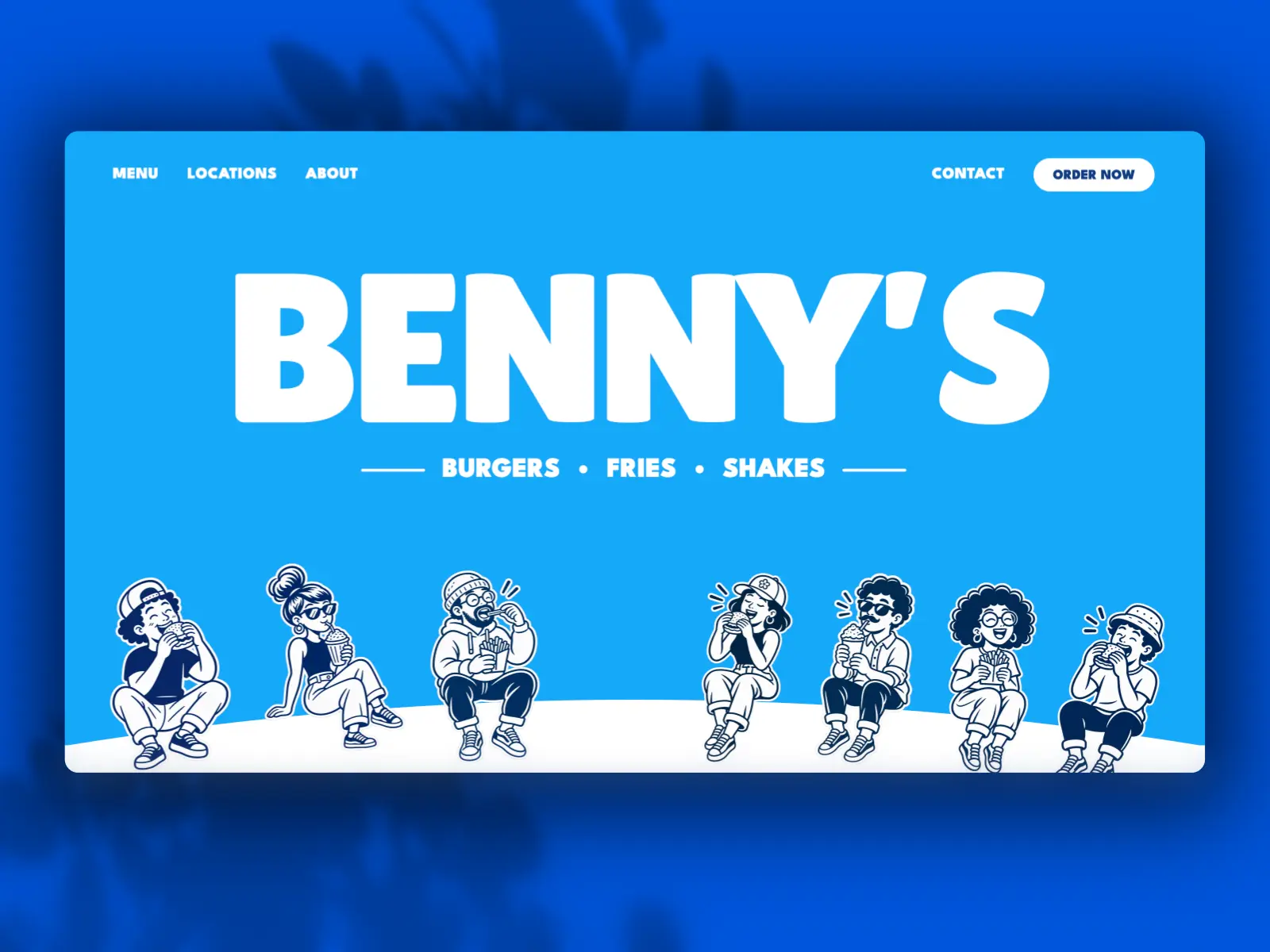
Benny's is a bold, playful website for burger joints, diners, and fast-casual restaurants. Chunky typography, a bright blue and navy palette, and a hand-drawn crowd of hungry characters give it the feel of a packed booth on a Saturday night. Every section is built to sell the food, from a giant wordmark hero that shrinks into the navigation as visitors scroll to featured favorites, catering packages, auto-sliding reviews, and one-tap delivery app buttons. A CMS-powered menu, locations with maps, an about page with a photo gallery, and a contact form with FAQs cover everything a busy restaurant needs online.
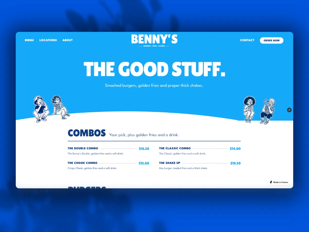
Combos, burgers, sides, and shakes are organized into clear sections with names, short descriptions, and prices lined up in one place. Every item lives in the CMS, so new specials and price changes can be published without touching the page layout.
Key Aspect 02
Ingredient Callouts That Back Up The Food
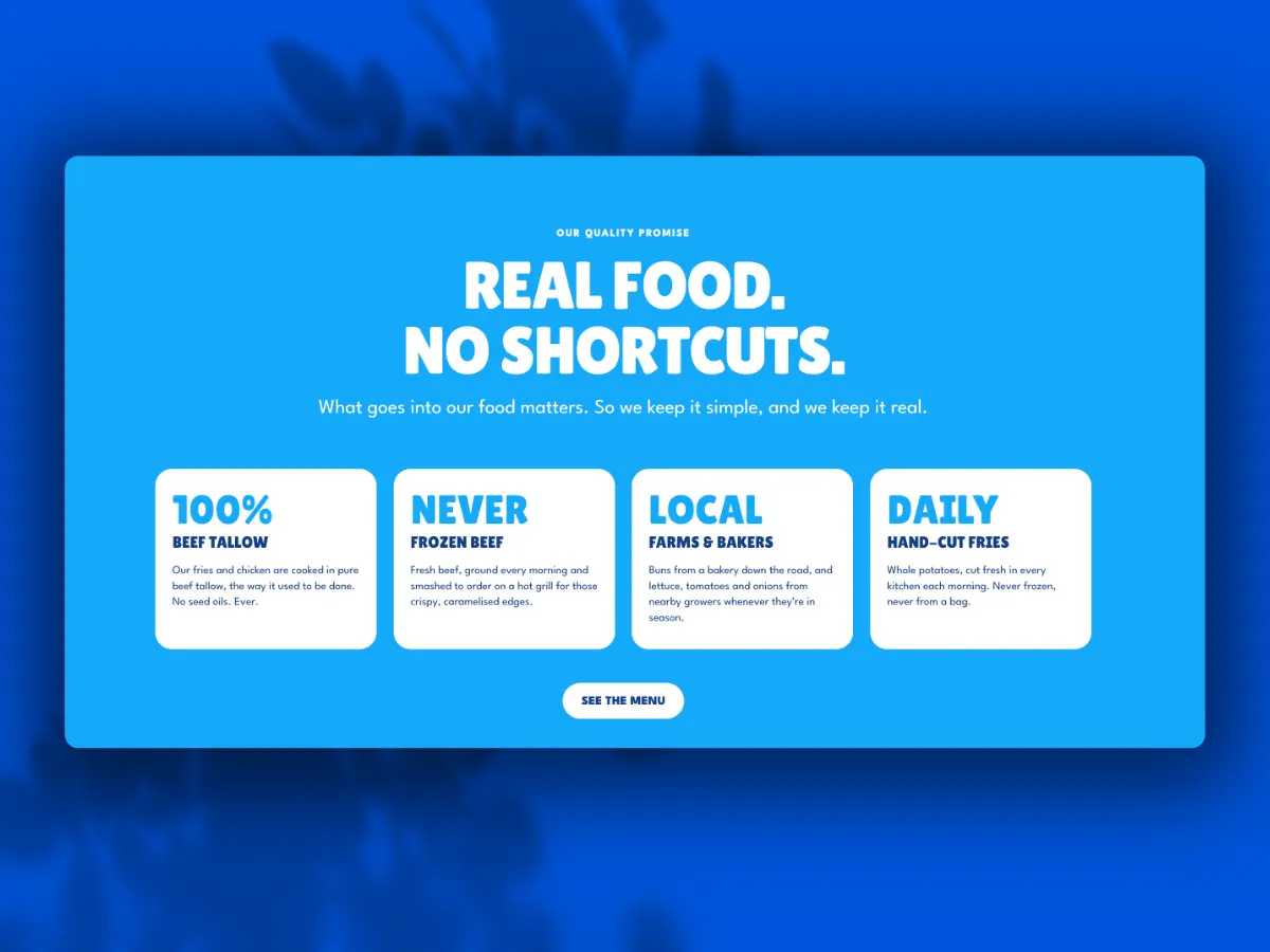
A quality promise section breaks down what goes into every order, including beef tallow, never-frozen beef, local buns and produce, and fries cut fresh each morning. Short, bold cards give hungry visitors a reason to choose this restaurant before they reach the menu.
Key Aspect 03
Count-Up Stats And Specials In A Bento Grid
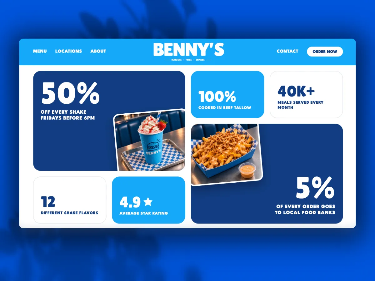
A bento-style grid mixes food photography with animated stats, including a weekly shake deal, a 4.9-star average rating, meals served each month, and a give-back pledge. Promotions and social proof sit side by side, so a quick scroll still leaves a strong impression.
Key Aspect 04
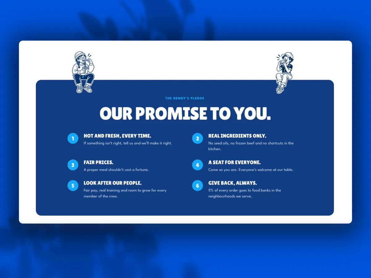
A Brand Promise That Builds Loyalty
The Benny's Pledge lays out six commitments covering freshness, real ingredients, fair prices, a welcoming table, the crew, and giving back. Hand-drawn characters perched on the card keep the tone fun while the copy gives guests a reason to come back.