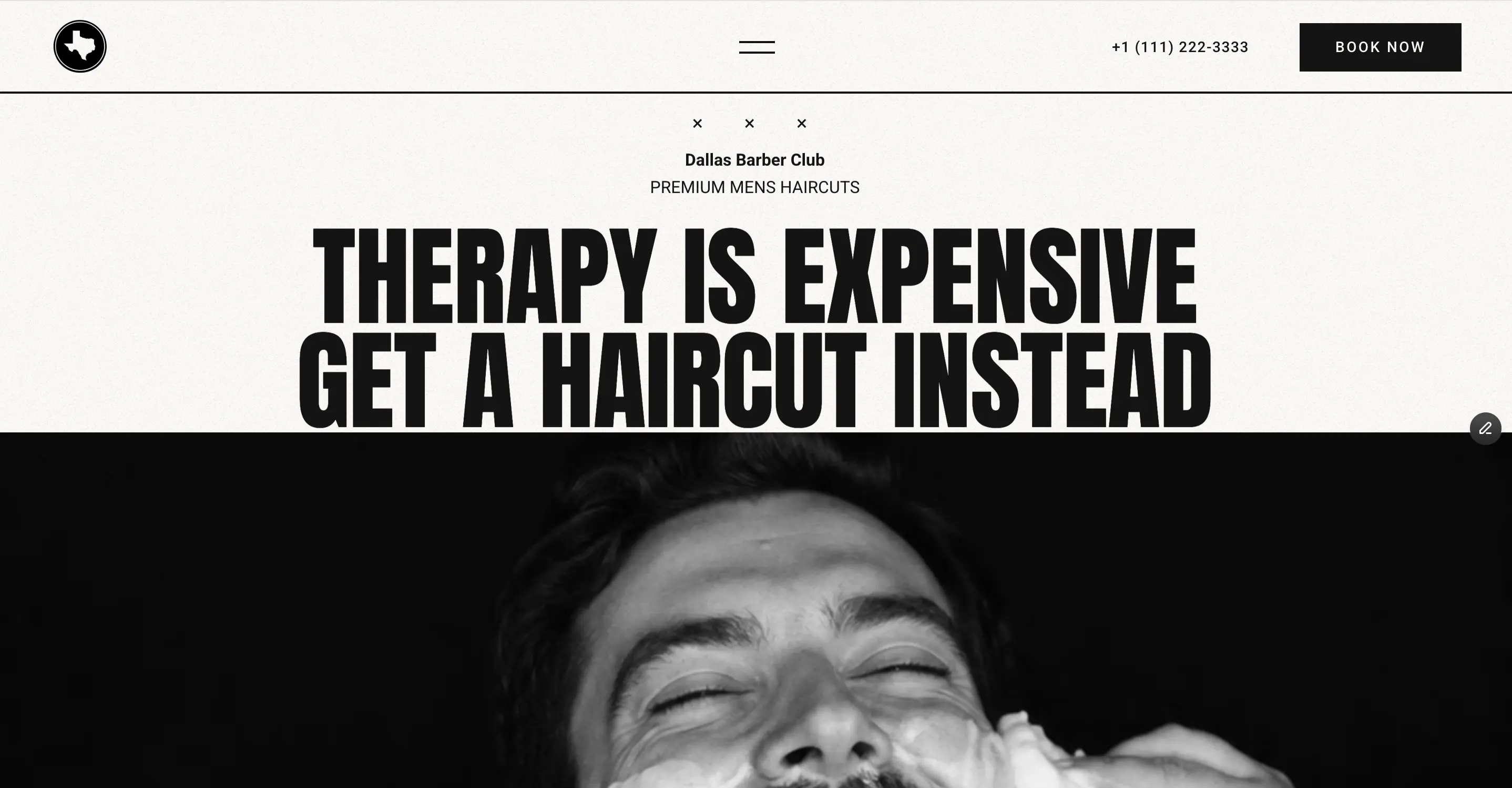
Most barbershop sites look like dental offices — Dallas Barbers Club does not. Bold editorial type, black-and-white photography, and a paper-grain texture give it the feel of a shop with regulars, not just customers, across a 15-section homepage covering everything from a tabbed service menu to gift cards, memberships, and Google-review testimonials. An animated splash screen, built entirely with native variants and no code required to edit, sets the tone before a visitor even reaches the hero.
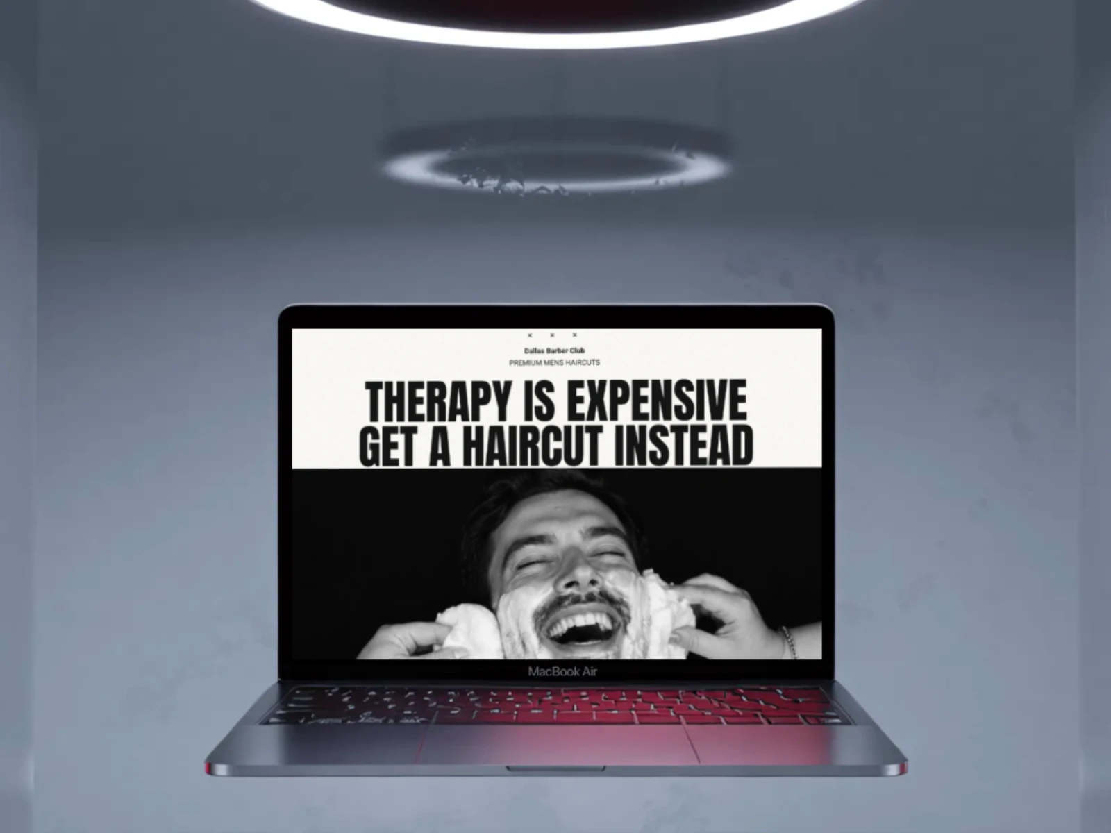
An oversized, editorial headline paired with black-and-white photography sets a gritty, personality-driven tone from the first screen, backed by a sticky navbar and a direct "Book Now" CTA that stays one click away wherever a visitor scrolls.
Key Aspect 02
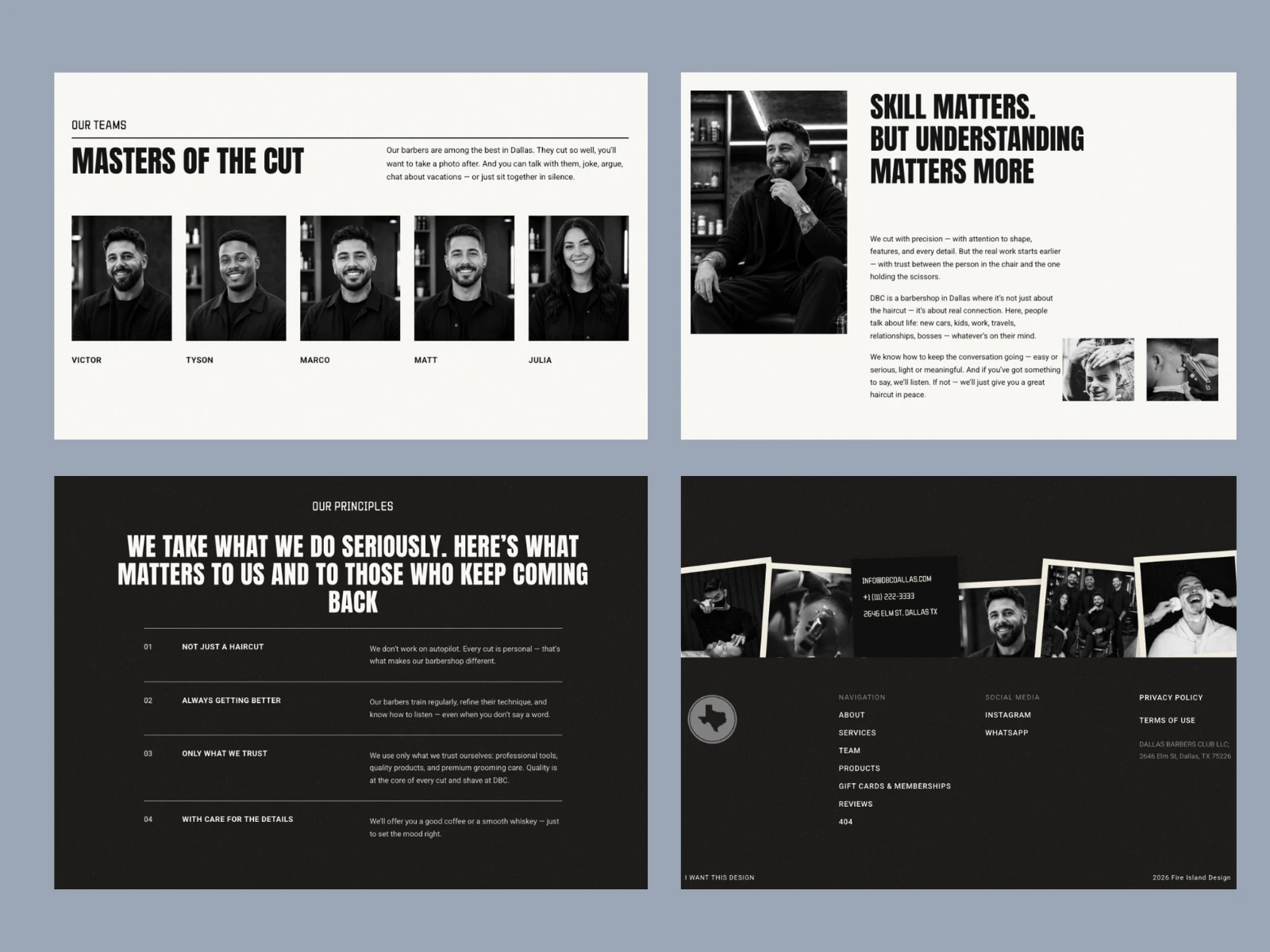
Team, Story & Shop Principles
A named team grid introduces every barber by face and name, followed by a story section and a four-point list of shop principles, giving the site the same lived-in, regulars-not-customers feel as the shop itself, right down to a footer with polaroid photos that pop up on hover.