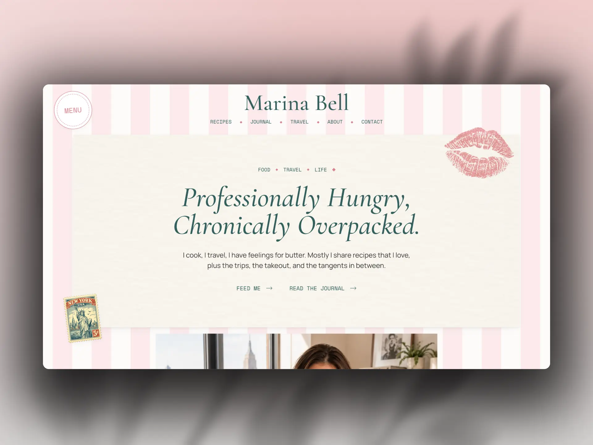
Marina Bell is a food, travel, and lifestyle blog built for a creator who cooks for fun and travels every chance she gets, and the site is designed to feel like flipping through a favorite cookbook rather than scrolling a typical blog. Pink stripe backgrounds, paper textures, postage stamps, and a lipstick-kiss motif frame layered photography and expressive script typography, while Recipes, Journal, Travel, and About sections all sit one click away in the navigation. The result reads as personal and collected rather than corporate, without losing the polish that keeps visitors reading past the homepage.
Key Aspect 01
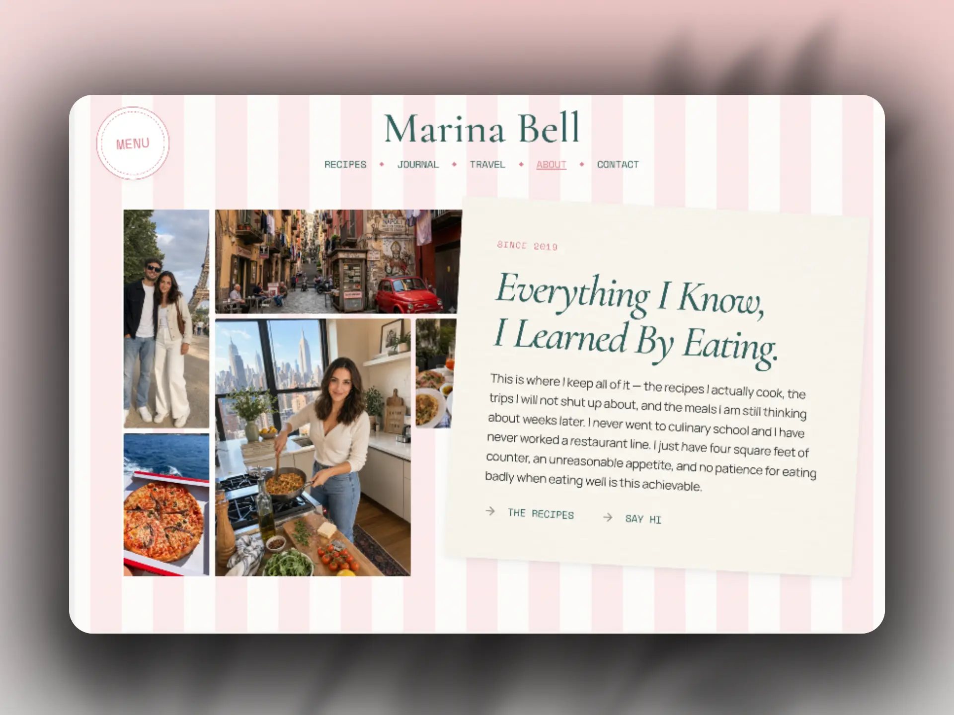
An About Section Built Like A Scrapbook
A collage of travel snapshots and kitchen photography sits beside a tilted, index-card-style pull quote, giving the about section the feel of a personal scrapbook instead of a standard bio block, while still linking straight through to the recipes and contact page.
Key Aspect 02
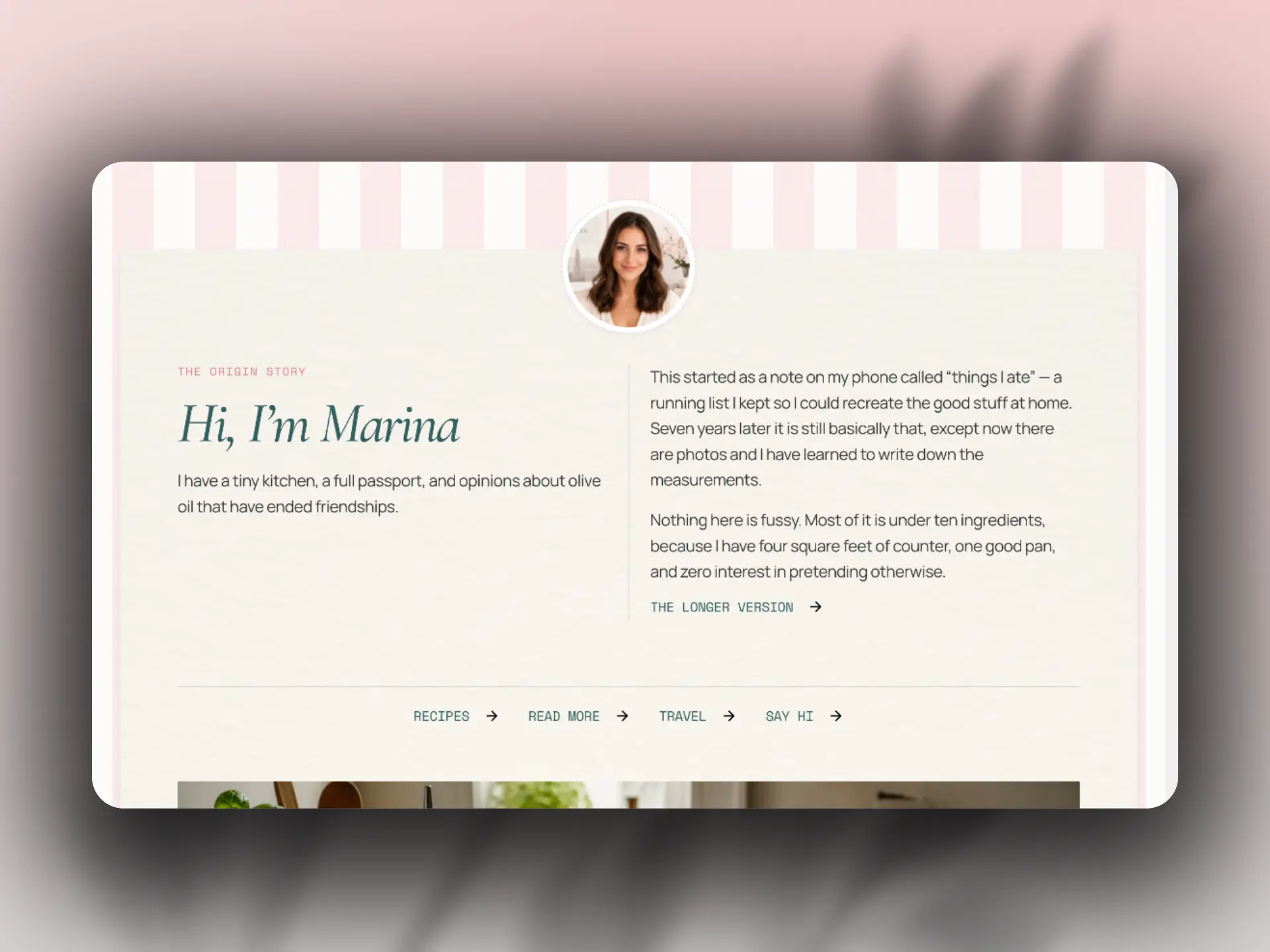
A Personal Voice, Not A Brand Voice
A Hi, I'm Marina introduction pairs a circular portrait with plain, first-person writing about a phone note called things I ate, backed by a quick-nav row into Recipes, Journal, Travel, and Contact so a new visitor never has to hunt for where to go next.
Key Aspect 03
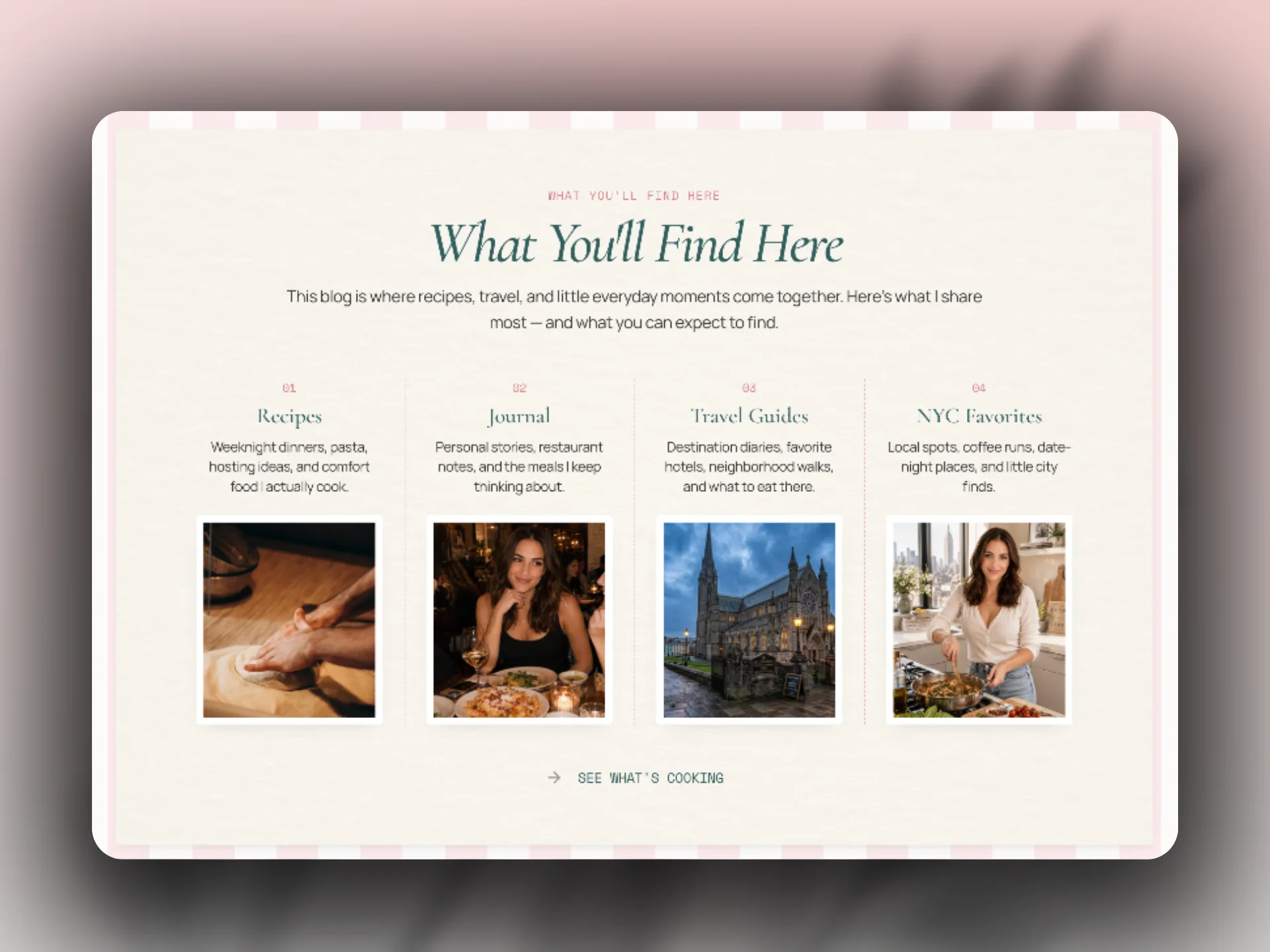
A Clear Map Of What's Inside
A four-column What You'll Find Here section previews Recipes, Journal, Travel Guides, and NYC Favorites with a photo under each category, giving first-time visitors an instant sense of the content library before they ever open a single post.