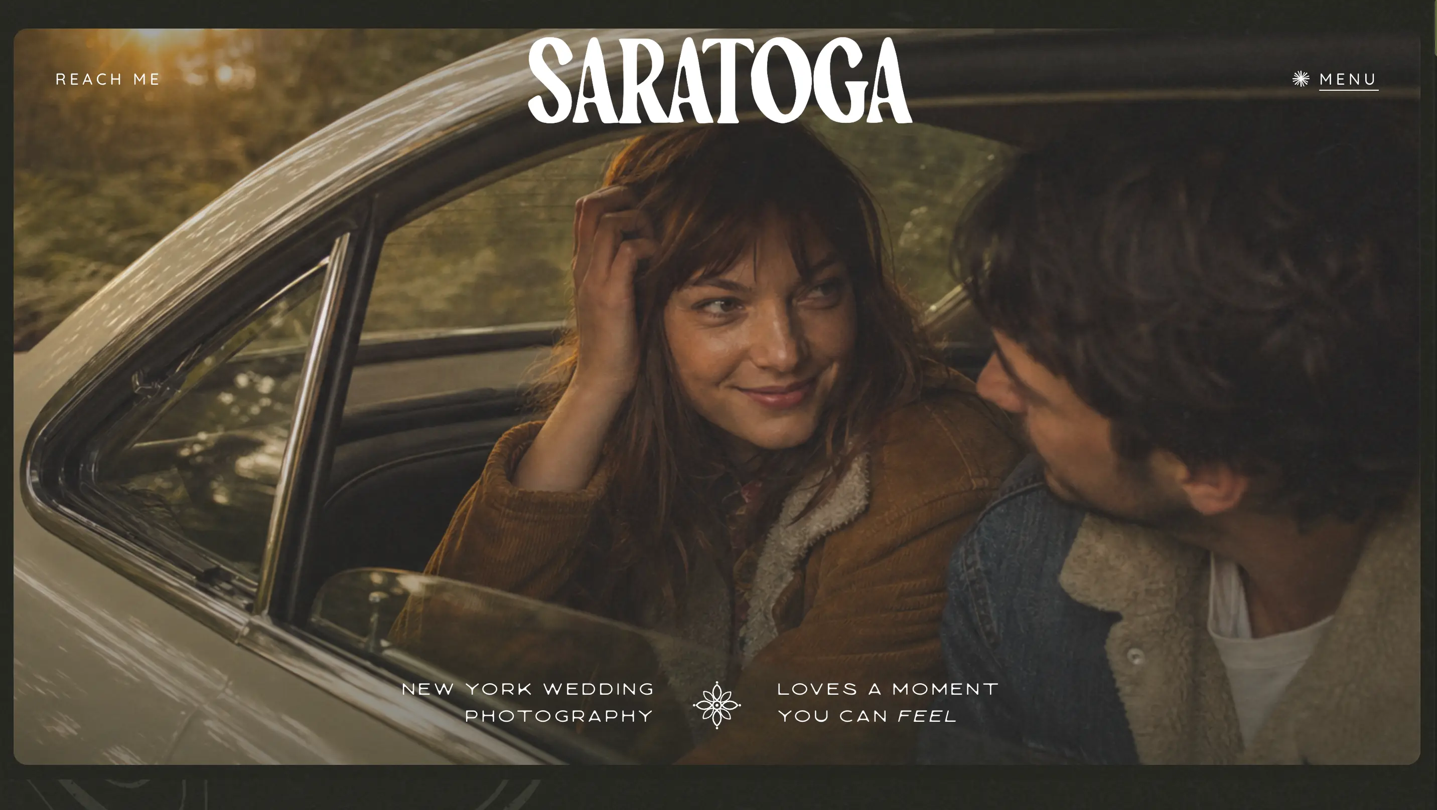
Saratoga is a freelance wedding and couples photographer working across upstate New York, and the site is built to sell a feeling rather than a package list. Warm, film-toned photography runs edge to edge against a deep olive palette, with couples, lifestyle, and wedding galleries, a personal about page, and a blog all sitting one click from the navigation, so a visitor can move from a single hero image to an inquiry without ever hunting for the next step.
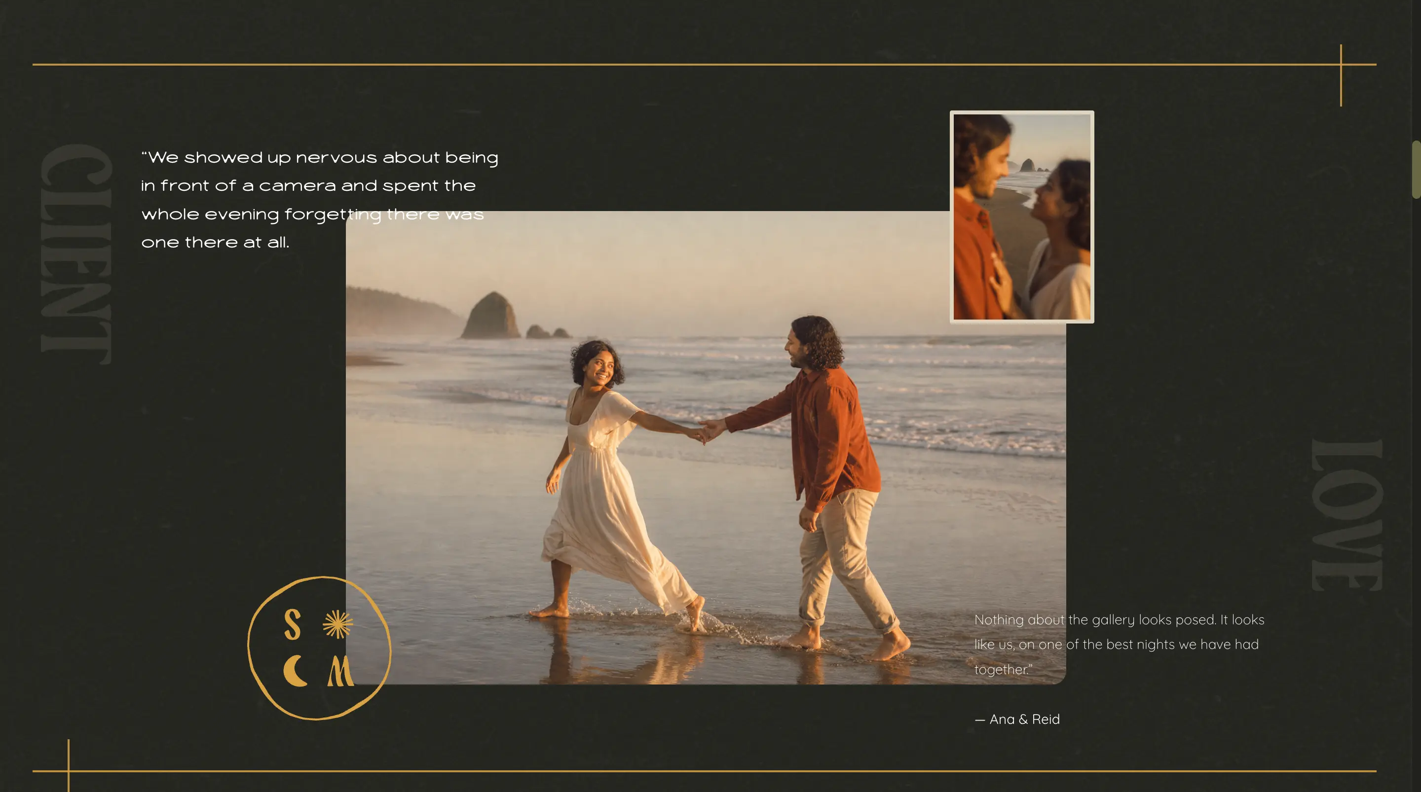
A client love section sets a couple's own words directly against the photos from their session, layering a full-bleed frame with a smaller inset shot, so the testimonial and the proof land together instead of sitting in a separate quotes carousel.
Key Aspect 02
A Photographer Page With A Real Voice
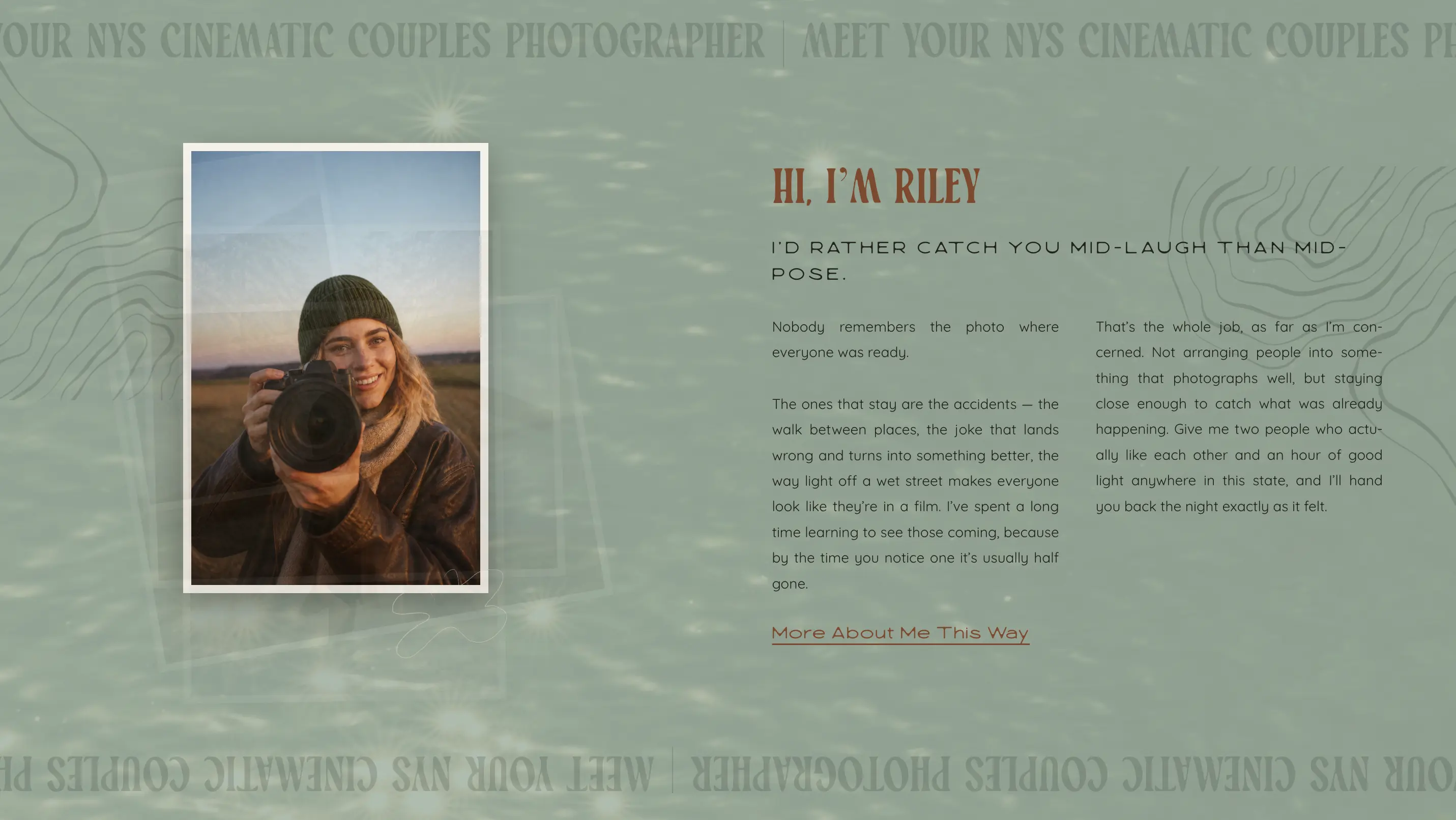
A Hi, I'm Riley introduction gives the business a face and a point of view, written in plain first-person language about catching people mid-laugh rather than mid-pose, backed by a marquee that names the service and the region for anyone searching for a cinematic couples photographer in New York.
Key Aspect 03
A Footer Built To Keep Visitors Browsing
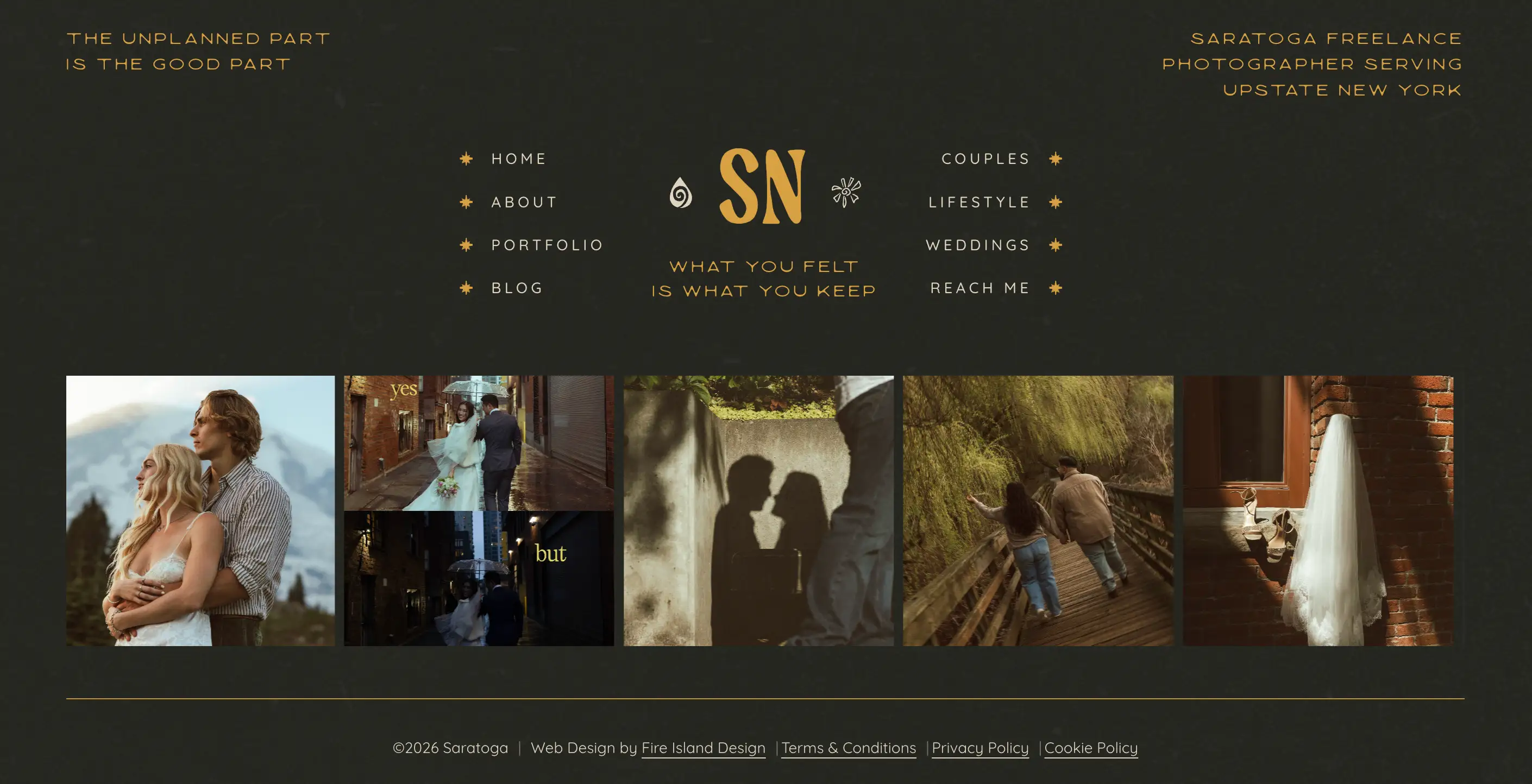
The footer works as a second navigation, splitting the site into home, about, portfolio, and blog on one side and couples, lifestyle, weddings, and contact on the other, with a five-image gallery strip underneath that gives a visitor one more reason to keep clicking instead of leaving.